ULTRA PREMIUM BRAND & PACKAGE DESIGNSTANDING OUT IN THE ULTRA-PREMIUM SPACE
THE CHALLENGE
Escasa Tequila began with a deliberately ambitious brief: Create an ultra-premium tequila with enough presence to stand apart in a rapidly growing and increasingly competitive category.
The package needed to feel elegant, modern and authentic, with a connection to traditional tequila craftsmanship, while avoiding the familiar visual language of the distiller’s existing portfolio. More than simply looking expensive, the bottle was expected to become an object in its own right: something distinctive enough to display on a home bar, collect over time and support a new annual Extra Añejo release each year.
THE APPROACH
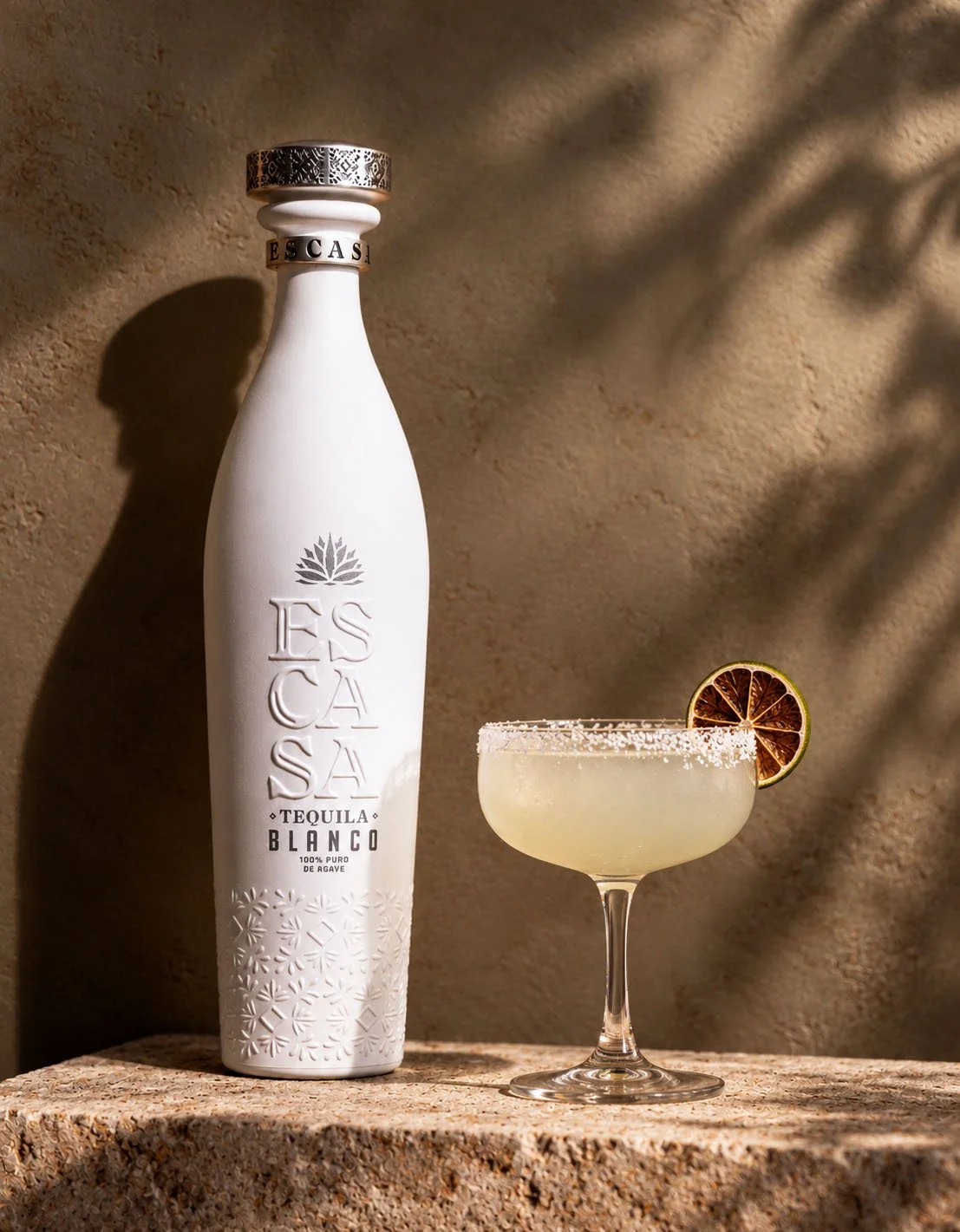
An unusually tall, elegant silhouette was developed to communicate premium positioning and create immediate visual differentiation. Its exaggerated proportions give the bottle a commanding physical presence, particularly in back-bar displays and bottle-service environments where height, visibility and recognition are critical.
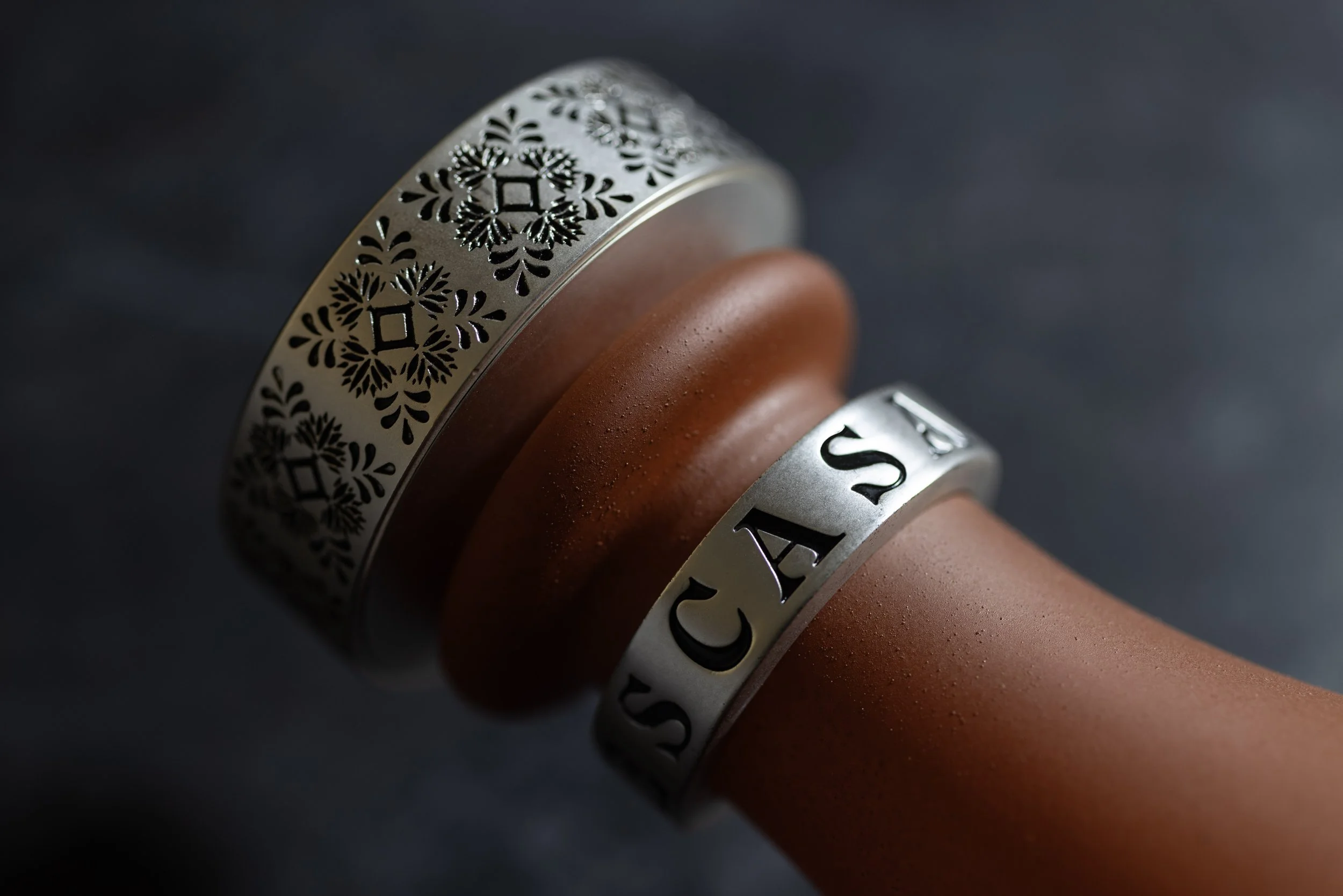
Opaque finishes further distinguish Escasa from conventional clear-glass tequila packaging. The warm, textured terracotta finish evokes traditional Mexican pottery, while the contrasting white ceramic-inspired finish suggests the refinement of handcrafted porcelain. Both communicate craftsmanship and authenticity through the physical character of the package, rather than relying exclusively on printed graphics.
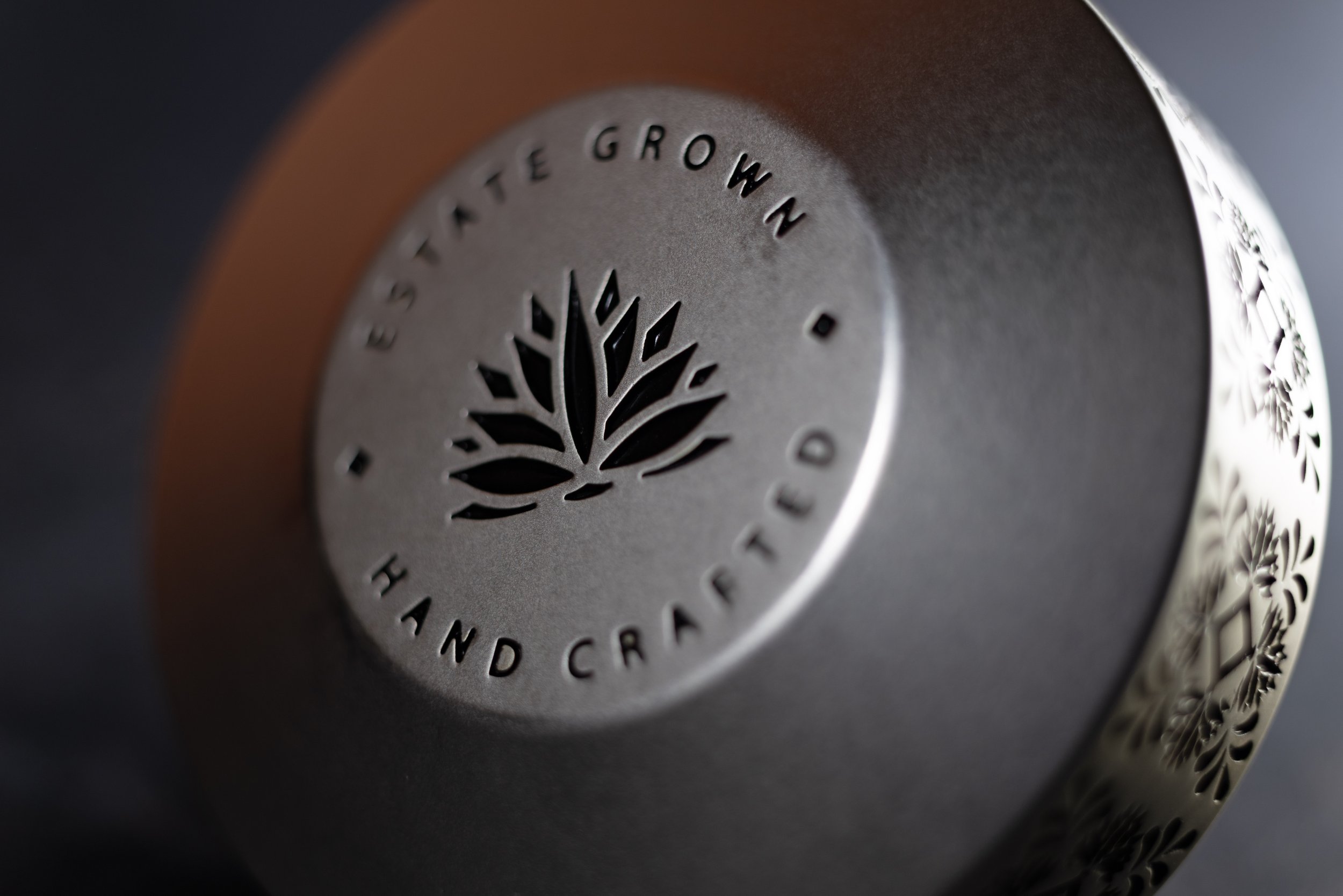
Decorative detailing draws inspiration from traditional Mexican handmade tilework, creating a distinctive visual signature that reinforces the product's provenance. The ornamentation adds richness and cultural character without overwhelming the clean, contemporary silhouette.
Bottle structure, proportion, closure, identity, typography, materials and decoration were developed together as a unified brand expression. Restrained labeling allows the distinctive bottle structure and tactile finishes to command attention.
THE RESULT
The finished design did exactly what the brief asked it to do.
Escasa presents a distinctive, ownable identity with the visual presence expected of a $200+ spirit. Its unusual height, opaque finishes and culturally inspired detailing establish a recognizable brand signature, while communicating the authenticity, craftsmanship and exclusivity expected at this price point.
The package was designed to perform across multiple commercial environments: commanding attention on the retail shelf, standing prominently in on-premise displays, and becoming an object of desire in bottle-service and at-home occasions.
It is simultaneously a functional package, a premium brand statement and a display-worthy object, with a consistent visual foundation for future expressions.