Portfolio Structure Audit & ArchitectureWHISKEY JYPSI BOTTLE DESIGN
SO MUCH MORE THAN JUST A PRETTY BOTTLE.
There's a surprising amount to consider when selecting a stock bottle or designing an original structure from scratch – a multitude of potential traps and opportunities that may not, at first, be apparent.
The famous Coca-Cola design brief from 1915 comes to mind. The bottle should be:
“...so distinct that you would recognize it by feel in the dark or lying broken on the ground.”
Fantastic. That's powerful. Jack Daniel's comes to mind, too.
Indeed, the shape of a bottle can communicate a great deal about the category it belongs to, the traditions it embraces or rejects, and the product inside. Long before a consumer reads the label, the bottle has already begun to establish expectations about quality, character, and price.
And that's just the beginning.
MORE THAN MEETS THE EYE
Beyond aesthetics and brand positioning, there are a host of physical and commercial realities that can profoundly affect a bottle's success.
Short, wide bottles can be beautiful objects. Their substantial proportions often communicate luxury and prestige. They make wonderful bar-cart trophies. Unfortunately, they're not always popular with bartenders.
Bottles that are awkward to grip, lift, or pour can become a nuisance in a busy bar. Exceptionally wide bottles may be displayed sideways on crowded back bars to conserve shelf space, potentially leaving their primary branding facing away from the customer.
And the speed rail presents an even more demanding environment. Bottles that are too wide, too deep, or difficult to grab quickly may be excluded entirely, missing opportunities for frequent pours, cocktail features, and bartender recommendations.
Retail presents similar challenges. Shelf space is limited, and an oversized bottle may struggle to fit within the modest horizontal space allocated to an individual product.
Then there are less obvious considerations.
Bottle proportions can influence perceptions of quality, price, and even the appearance of the liquid itself. Heavy glass feels substantial and luxurious, but weight directly affects unit economics and shipping costs.
Curved surfaces, tapers, and unusual geometries can complicate labeling and decoration. Neck finishes dictate closure compatibility. High-speed bottling lines may require expensive modifications or specialized change parts to accommodate unusual shapes.
And for proprietary glass, tooling expenses, minimum quantities, and production lead times add another layer of complexity.
The challenge is to balance all these competing considerations without sacrificing the character that makes a bottle distinctive in the first place.
WHISKY JYPSI
Whisky JYPSI was conceived as an unconventional premium whiskey brand, rooted in exploration, independence, and a willingness to challenge established traditions.
The original brand brief explicitly rejected the traditional, the predictable, and the conventional. Yet the bottle still needed to be recognizable and credible as premium whiskey packaging.
How do you design something that deliberately rejects convention without abandoning the visual cues that help consumers understand what they're buying?
The answer began with proportions.
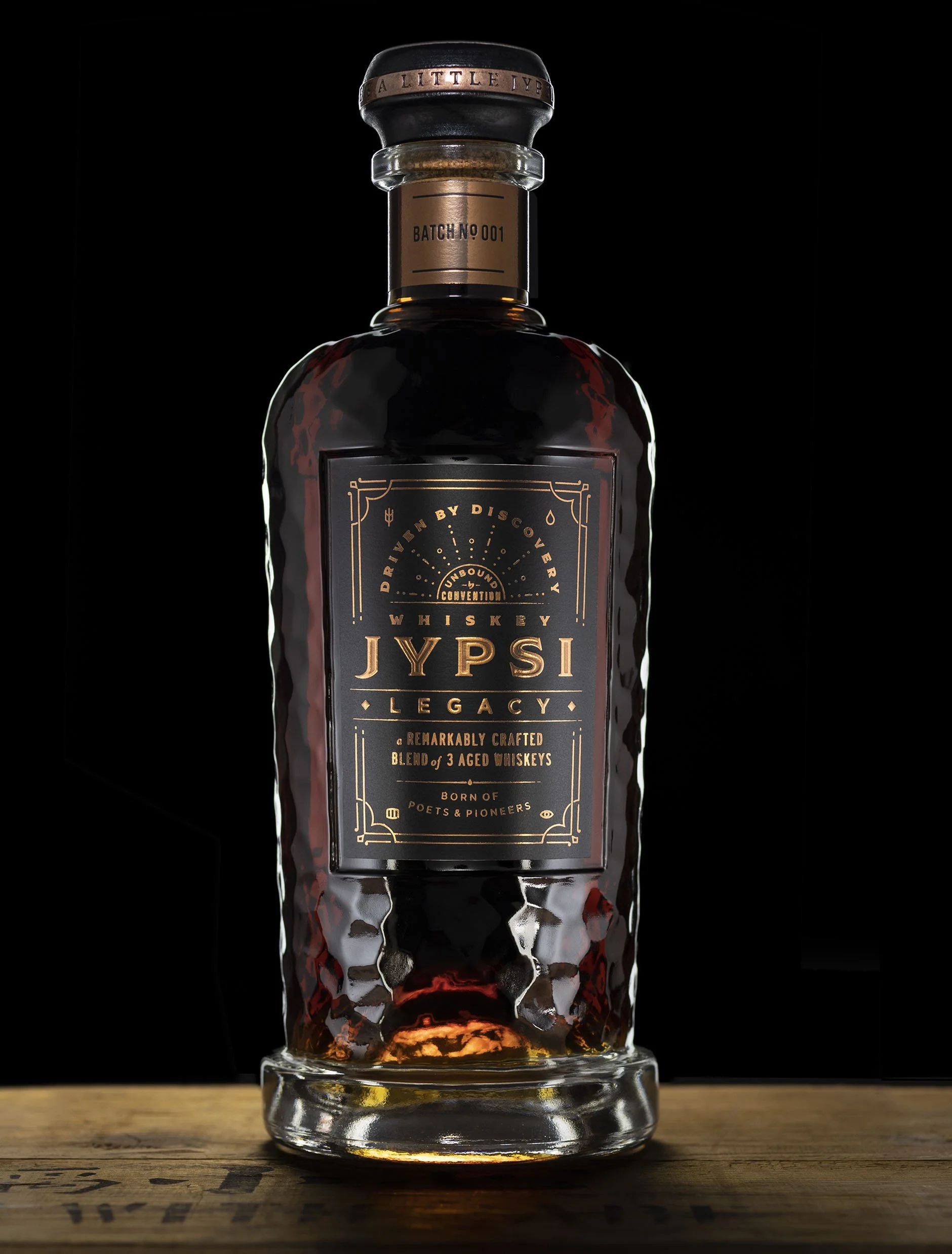
The JYPSI bottle occupies something of a Goldilocks Zone. Its silhouette is substantial enough to suggest traditional whiskey heritage and masculine character, yet tall and narrow enough to accommodate the practical demands of retail shelving, back-bar presentation, and speed-rail use. The resulting silhouette strikes a deliberate balance between elegance, character, and utility.
From there, a series of carefully considered details give the bottle its distinctive identity.
A deep punt adds visual interest and concentrates substantial glass weight toward the base, creating a satisfying sense of quality without unnecessarily increasing the weight of the entire structure.
A broad, substantial lip gives the neck a crafted, traditional character, complemented by an oversized wooden bar-top closure with a decorative metal band.
An unusual molded ring at the neck-and-shoulder junction provides another distinctive detail, while a raised foot at the base completes the silhouette.
But the bottle's most striking feature is its surface.
A subtle, all-over texture inspired by hand-hammered copper whiskey stills catches and refracts light across the glass, establishing a tactile connection to traditional distilling craftsmanship. A smooth, recessed label panel is integrated into the textured surface, providing an ideal application area without interrupting the bottle's visual character.
Each element contributes something, yet the finished design remains cohesive, confident, and surprisingly restrained.
The result is a bottle that reconciles an unusually broad range of aesthetic, functional, and commercial considerations without looking like a compromise.
Distinctive enough to establish its own visual identity. Practical enough to function in the real world. And unmistakably premium.
The original Whisky JYPSI bottle design was subsequently awarded a U.S. design patent, naming David Cole as inventor.
THE BIGGER PICTURE
A spirits bottle is far more than a container. It's an expression of the brand, a functional tool, a production component, a merchandising consideration, and a significant financial investment.
Understanding how those responsibilities interact, and anticipating the opportunities and problems they create, requires specialized experience.
Much of the most important design thinking happens long before the first label is created.