Portfolio Structure Audit & ArchitectureGIVING A FAMILIAR BRAND NEW PURPOSE
Everclear had extraordinary brand recognition, but much of that recognition came with decades-old baggage.
After decades with little marketing support, the brand was looking to move beyond its reputation as simply an extremely high-proof spirit and introduce itself to a new generation of consumers interested in craft cocktails, infusions and making things themselves. The challenge was to modernize the brand without alienating its remarkably loyal existing customers, many of whom had been buying Everclear for years.
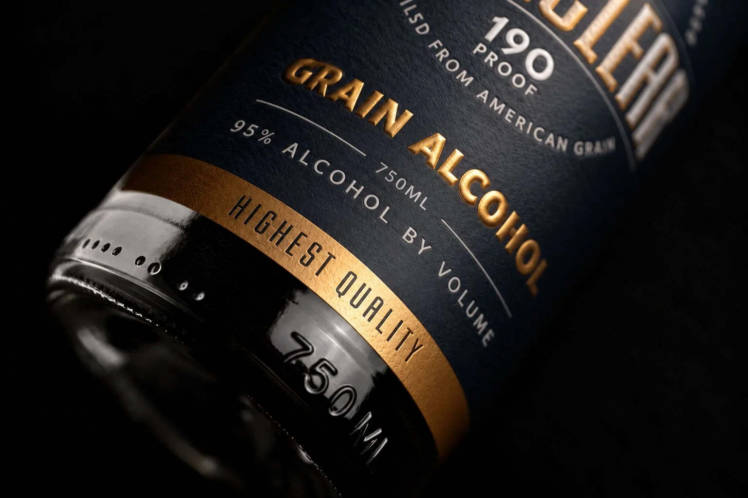
The packaging redesign needed to accomplish both. A radical departure risked sacrificing decades of brand recognition, while a more conservative update might fail to change perceptions or attract new consumers. The solution was a carefully balanced evolution of the existing identity, retaining its most recognizable visual elements while introducing a cleaner, more contemporary design. The result was a package that felt familiar to longtime customers but presented Everclear as a more sophisticated, versatile product to a new audience.
Delving into the project, however, revealed another – more complicated – problem.
Everclear wasn't being introduced for one new use, or even to one new audience. Its high proof and neutrality made it useful in several distinctly different ways: as a culinary tool for extracting flavor from ingredients, as a base for creating infusions and cocktail components, and as an ingredient used directly in mixed drinks.
Trying to explain all of that, on a bottle, was cumbersome and invited overcomplication. The solution was to reduce three distinctly different use/audience cases, each to a single-word offering:
EXTRACT • INFUSE • FORTIFY
Each of these words addressed a different application and audience. Extract speaks to culinary uses such as vanilla and other homemade extracts. Infuse opens the door to bitters, shrubs and more experimental cocktail ingredients. Fortify addresses direct use in alcohol-forward cocktails without reverting to the irresponsible high-proof messaging the brand was trying to leave behind.
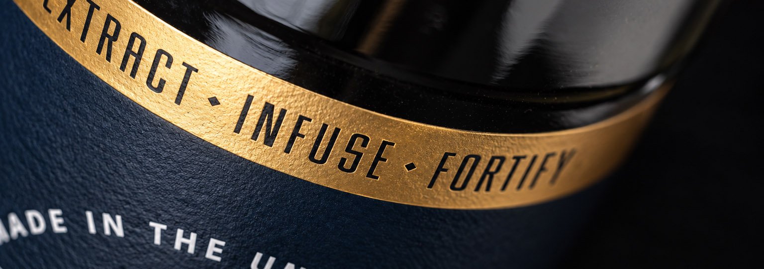
Together, the three words turned a complicated messaging problem into a simple expression of what Everclear could actually do.
The result was more than a visual update. The new packaging and messaging worked together to give an iconic but misunderstood product a clearer contemporary role, preserving the recognition and loyalty Everclear had earned while inviting an entirely new audience to see its possibilities.