Details.
As Rod Stewart once said, every picture tells a story, don’t it?
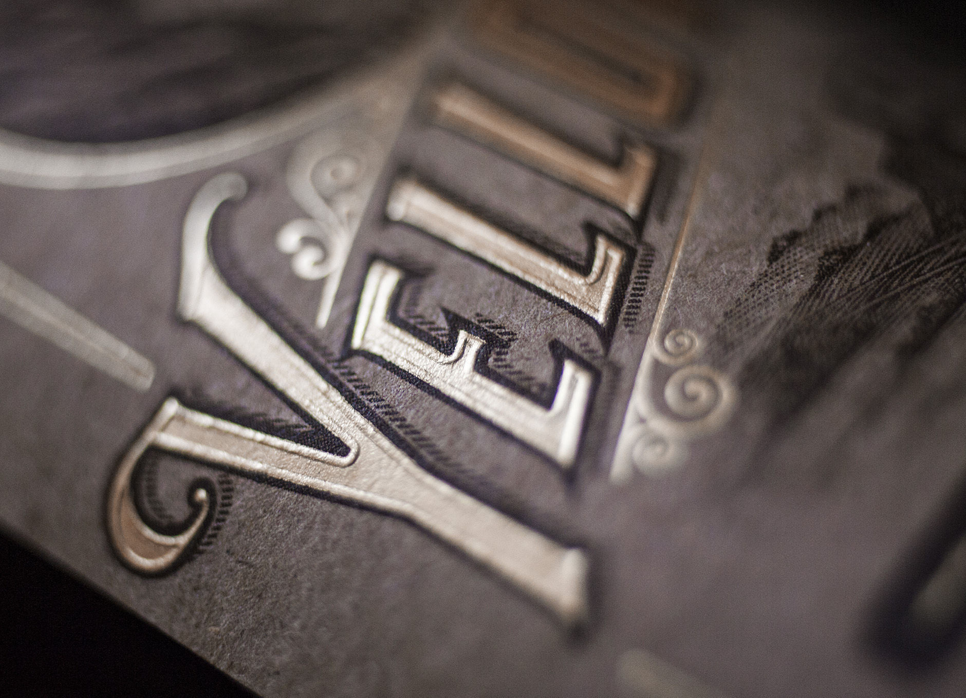
This picture tells of an unlikely combination of reflective gold foil and rough, post-consumer, recycled kraft. The resulting textures and contrasts achieve exactly the desired balance of richness and warmth. It tells of strict attention to detail, where the radius of every curve in every letter was painstakingly hand-drawn, and every hash mark in each letter’s shadowing was rendered with equal care – not generated by a font effect or “canned” computer filter. It tells of the rewards of fighting tooth-and-nail through an arduous, uphill pre-production process that threatened at every turn to remove the warm, textured real kraft paper and replace it with a cold and soul-less simulated, printed brown paper background image. And finally, it shows the payoff of trying new ideas and reaching further, through an uncommon use of a blind-embossed border around each letter, adding depth and visual appeal in a way I don’t think you’ve likely seen ever before. All that story – from an area smaller than a single square inch on this bourbon label.
View more of this label here.
