Inside My Outbox – Pushback From Printers & The Importance of Paper Selection

Here’s another actual email from my outbox. I just sent this to a distiller with whom I’m working on some cool new labels for his cool new spirits. Names have been changed – per usual – to protect the guilty.
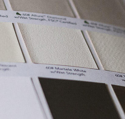
I have worked with a lot of label printers, going back over 13 years or so. Some of them are competent, some of them are not. Some of them are helpful, some of them are not. But they ALL push back when I specify any interesting papers or processes. It’s very efficient for them to buy these BIG rolls of a certain “good enough” paper, stock that and run everything on it. Most people don’t know or care about the difference… it’s good enough! So the printers get just slightly out of sorts when I look in the swatch books and select anything other then the (literally) run-of-the-(paper)-mill stock. They grumble and sigh and have to try a little bit to make it work. I know how people hate putting effort into something they can usually do with their eyes closed. They say “It might be more expensive” or “it might be harder to get” – but it rarely is. This is why I have my own swatch books by the way, and went to great lengths to get them from a variety of paper manufacturers.
It always turns out that – Oh, we actually happen to have some of that (or can get it tomorrow) – it’s not a big deal. And the results are always worth it.
They ALL do it – good ones and bad ones alike. Notice how just standing our ground even a little bit gets us what we wanted when it would have been so easy to roll over and say OK, fine, go with the [boring paper]. Now your labels will just have a little something special in the tactile experience. Something I haven’t seen over and over and over again (like boring paper). And that tactile experience is a very important (and often under-appreciated) aspect of a quality packaging solution – especially with premium, hand-made stuff, like your [spirit]. Not so much with frozen peas. But [your spirit]? Hell yes. You want it to look good from ten feet away. Then you want it to feel good in the hand and reflect quality up close. People pick up the bottle for a closer look – they are still assessing the quality at this point. Then you want it to taste good! Now we have all three.
I believe that how a bottle looks and feels factors highly into how people perceive the taste of the product. Not in a blind taste test, of course. But doesn’t the fact that we even do blind taste tests speak volumes to the role that brand and design (and materials) play? If it wasn’t an influencing factor, then why would we bother doing blind tests? A cheaply designed or printed label sets you up for low expectations and your tongue might not know well enough to be able to override that unfortunate expectation. There are a lot of inexperienced or under-qualified drinkers out there. Most of us aren’t sommeliers. Sadly, we include a whole host of other information when we are deciding what tastes good – other than the taste. We include a whole cocktail of rumors, assumptions, associations, childhood memories, beliefs and all kinds of random crap, most of which comes from the name of the brand/product, the label design, the shape of the bottle, the price, the ambiance of the store we bought it in, the friend who gave it to us, what your dad used to drink, the location in which the product is made (Kentucky vs Tacoma) and any actual reputation we might be aware of. None of that is fair to the distiller, who has no control over most of those things. But we can control some of them, and by gum, I say we grab those few things that wan can – and control the shit out of them. Who’s with me??