Printing Can Be So Much More…
I can’t tell you how I’ve had to fight for my print specifications in the last year. Feels like I’m pulling teeth. I’m not asking too much – I know what’s available, possible and reasonable. So why is it that all these print shops act like I’m trying to push the envelope (literally, sometimes) when I ask for anything other than white paper, digital CMYK printing and gloss varnish? You’d think I was asking for glow in the dark ink on edible, non-GMO paper. I work with some very talented, experienced, helpful and wonderful printers who I appreciate very much. But they can all have their moments where they just don’t seem to want to bother. You have to watch them! They will slip you that old glossy white paper at the last minute!
Thankfully, if you keep asking, they will often “run a test.” Usually they are skeptical and often resistant to the idea, but they will give in eventually. And guess what: All the tests I’ve requested have been successful. Every time. I guess I just had to get them to prove it to themselves.
The latest example of much consternation was the application of black ink to a folding, chip-board carton. My client’s brand is such that the warmth and rustic texture of chipboard are perfectly appropriate to their personality and that of this product, a limited-release, straight bourbon whiskey. The bottle will retail inside this carton, which has a die-cut window in the front so you can see the bottle and label. I don’t know how you drink whiskey, but when I open a bottle of hundred-dollar hooch, I take my time. It’s almost ceremonious. I want to savor the anticipation almost as much as I want to savor the whiskey – from washing and drying my best glasses to pulling the cork and pouring it. The materials used in the construction of the box, bottle, labels and cork should support this experience and re-enforce what the distiller is saying: “We put a lot of thought into this product and we want you to enjoy it.”
If you opened this box and found the blank, unprinted inside to be a standard, bright white paperboard would you be disappointed? Probably not. Would the white edge of the cut-out window upset you? Doubtful. But it just might feel a little cheaper than it could. Like a “product” from a “factory.” I don’t think handmade, American, luxury goods should feel that way. White paperboard is for toothpaste boxes. Not bourbon.
Here’s my point, two of them, actually.
1. Small changes in print specifications and materials can have a huge impact on the look, feel and personality of a printed piece. And it doesn’t have to mean a big increase in the production budget. There is plenty you can do to add warmth, tactile interest or luxury to your printed pieces without adding a single dime to the bottom line – but don’t expect your printer to suggest these things. They would rather use what’s easy, tested and in stock.
2. To fight these battles you need to know what you’re talking about. Or find examples. Or trust your designer. Managing print specs is a big part of how I spend my time. I’m on the phone, taking photos, picking swatches, writing long emails and sending samples around literally every day to make sure my client’s work comes off the printing press looking and feeling as wonderful, unique, luxurious or brand-appropriate as it should be. Don’t underestimate how much time and effort this takes. It’s a big part of the job and yet it’s easily – and often – overlooked.
If you manage your own printing, stick to your vision. You don’t have to settle for boring, white paper and gloss varnish. There’s a whole world of options out there for you and they are very doable. See something you like? Keep a sample or take a photo. Show your printer or designer and stand your ground. They will figure something out for you. In the end it makes a big difference and I bet you’ll be glad you did it. I always am.
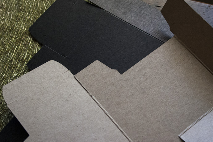
Today’s test results: The black ink flood looks amazing on this paper and it doesn’t crack at all. Now on to production!
