Case Study: Caffe Lusso Brand Development
View more Caffe Lusso Portfolio Images here.
Philip Meech of Caffe Lusso coffee roasters is a true artist. And a scientist. I first met Phil about nine years ago when I worked at a small design agency in Redmond, WA. We were developing a private label coffee brand at the time and Caffe Lusso was to provide the roasted goods. As a means of infusing our creative team with the background knowledge necessary to facilitate an informed brand development, Phil came to our office and gave us an informal – but ridiculously informative – presentation on the processes involved in roasting, brewing and cupping the best possible cup of coffee.
He blew my mind that day.
In the following weeks, I developed a coffee brand for my client from the ground up (name, logo and packaging) of which I was very proud. It was well received and ready to go. Sadly, at the eleventh hour, the entire private label deal fell through and the coffee brand-to-be faded to obscurity forever. But something good and everlasting was to come of all this: I was forever changed. I would never see coffee the same again. Phil had made a lasting impression.
Almost nine years later, I have continued to think of Phil’s coffee and practice the lessons he taught us that day in my own coffee brewing. So I reached out to him recently just to tell him how he had influenced my thinking over the years. I stopped by the roastery, he made me an amazing latte, and we talked shop. As it happens, he was on the threshold of rebranding his own company, Caffe Lusso. The planets aligned.
So I came by again a couple weeks later and we talked some more. We discussed at great length the origin and inspirations that were meaningful and relevant to him and his product. We were understanding each other and making headway just fine then we had one of those moments that you just can’t synthesize. I was leaning on his espresso bar, literally two feet from the roaster, which was full with a fresh batch of green coffee beans, turning browner (and smelling more amazing) by the minute.
I asked Phil, with genuine wonder, “Why can’t I get a cup of coffee this good anywhere else?” I wasn’t trying to flatter him, I was honestly curious. Surely there are others trying just as hard, with plenty of brains and experience. But damn – they just aren’t this good. They really aren’t. What gives?
He didn’t seem at all surprised by this question, I think he’s heard it before. He told me about Caffe Lusso’s unique and comprehensive commitment to the age-old “Four Ms” of the Italian espresso making tradition. They are as follows:
• Miscela: The coffee blend
• Macinatura: The grinder
• Macchina: The espresso machine
• Mano: The skills of the barista
Caffe Lusso, more than many other roaster I know, is not only committed to – but able to address all four links in the chain. They source and roast the beans. They hand-pick and sell the equipment. They even train the baristas and are currently ramping up their training program. I could go on all day about this – it is in fact the crux of the answer to my question – but I have to fast forward a bit to the part about the logo.
I listened to Phil as he explained how easily the chain can be broken – the the detriment of the final cup of coffee. I had a random thought and mentioned it aloud.
“We could add four Ms to the logo. They would blend in – inconspicuous like roman numerals – but it would give you an excuse to tell your story, if asked.” I figured it was along shot – or not that interesting of an idea. Phil went on talking about volatile oils, distilled water and triple confabulated vacuum extraction – and I forgot all about it.
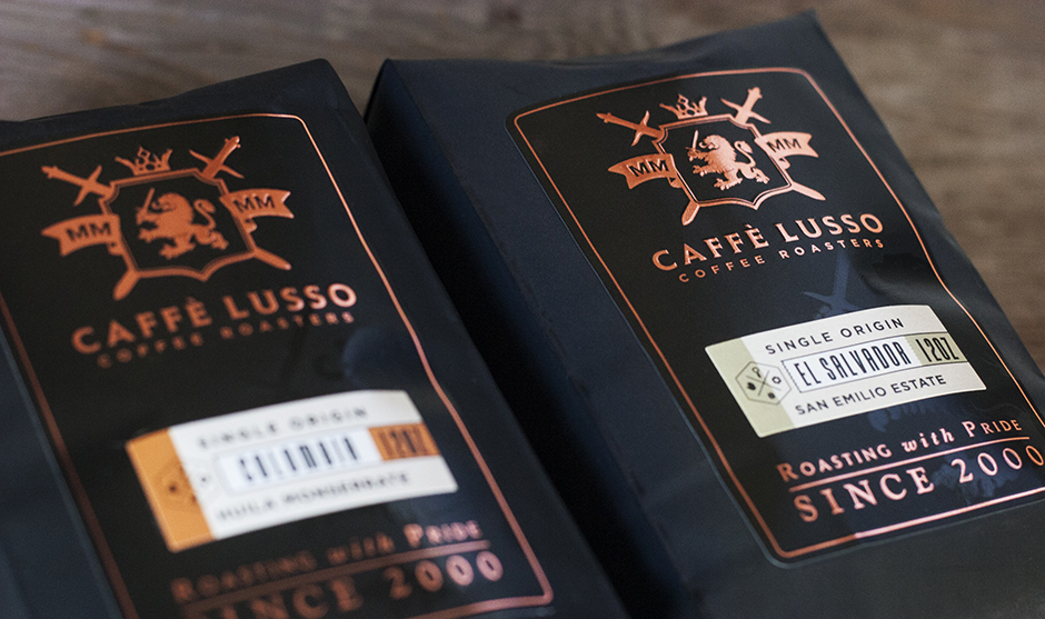
We continued talking for quite some time – looking at the competitive landscape and some sketches I’d brought with me. We talked about other ideas and were starting to gravitate toward a luxurious, old-world traditional feel being right for the brand – but what imagery is appropriate within that context? What symbolism makes sense, carries weight and actually means something? Hearkening back to old-world heraldry makes sense on many levels for this brand, and that is direction we chose. But what about the details? The crown represents supremacy. It’s a mark with a long tradition. The lion not only conjures up a luxurious (Lusso mean luxury in Italian), royal lineage, but it’s the national symbol of Etheopia – where coffee was first discovered in the middle ages. We’re getting somewhere – Then Phil interrupted me:
“I can’t stop thinking about that four-Ms in the logo idea – it’s the very CORE of what makes us unique…”
We went a little further down that road and Phil started getting excited – and so did I. He started escalating the prominence of the four Ms from a minor detail to a place of greater prominence. Suddenly we had a totally unique and perfectly meaningful concept for a logo. Something that no one else had – with a meaningful backstory – and a big conversation starter that begs the question: What do these symbols in your logo mean? What better way to tell the whole story? I’ve told people a hundred times that their logo isn’t a brochure. You can’t tell your whole story in a single square inch of design, But damn if we didn’t just do exactly that.
I went home and couldn’t even hold the floodgates back. I couldn’t even get home. I had to pull the car over and write and sketch. I started filling pages with sketches. I was sketching as fast as I could to get each idea out of my head and capture it before it was replaced with a new idea. There are so many ways to express this idea, graphically. Sometimes you’re struggling for imagery or symbolism. Sometimes you’re stretching it a bit “the circle in your logo means continuity” or “These interwoven lines represent your partnerships…”
We designers do our best to merge meaningful imagery, unique marks, graphics that represent the right personality and it all just “looks cool” at the same time. But sometimes you have to sacrifice one of those things for the sake of one or all of the others. Or you’re working backward from a great looking mark to fill it with meaning. We sometimes call it writing “rationales.” Not this time. The concept came first like a beacon of light. And there a thousand ways to express it – all of which will be unique. Now we just have to make it look and feel right. No problem. There are other symbols in the logo. And some additional supporting elements, all of which bring meaning to the brand. I’ll leave a little to your imagination, or you can ask Phil. By the way, that lion is an original, custom illustration for Caffe Lusso. No clip art here.
We are both excited about the results.
This was a 50/50 collaborative idea. Neither of us came to it on our own. We had our heads together, sharing some coffee, speaking casually and being honest with each other. No pride, no secrets and no bad ideas. I had a random, incomplete thought and spoke it, unfiltered. Phil reinterpreted that and ran across the goal line with it – not hiding his excitement, not holding back. Could I repeat this process? Not on command. Will I get lucky again? Probably. Similar lightning strikes have happened before. But you just can’t force it. It happened naturally and that’s how I know it was real. That’s what it’s all about.