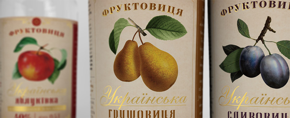
Sneak Preview: Ukrainian Eau de Vie Package Design
UPDATE: See actual photos of the completed, printed labels here.
I’m excited to see these labels starting to take shape. Designing labels in a language that I can’t read, for a client in city (Kiev) in the middle of an uprising has – surprisingly – proven less challenging than one might expect.
The product in question is a line of five traditional fruit brandies, made in Ukraine, with all Ukrainian fruit. They were kind enough to ship me some samples and the flavor is very much aligned with the best eau de vies I’ve ever had – plus a little something different, which I attribute to their unique tradition and local fruit.
Shown here are 3D digital renderings, which are a great help in testing and visualizing the final product. At this phase, some details are still subject to change. The final product will likely look slightly different as the closure and a few other loose ends are refined.
I’m very much looking forward to seeing the real paper labels on real glass bottles as these go to production in the coming months. The digital renderings are priceless, but nothing quite compares with the richness of real paper, the warmth of real glass and the glow of real light. More photos to follow at that time.


On this one you can see how it looks without the gold foil. This is the kind of visual “testing” that can be accomplished with the help of 3D renders – a big help in the decision making process as I and my clients weight the costs and benefits of various production techniques and details. These are not the same renderings I would create for consumer-facing sales materials, by the way. These are more of a behind-the-scenes, working sort. A more refined (and time consuming) process would be used if these were to appear in any sales materials, which would attempt to capture just a little more of that real-world magic and warmth.
