Specially-Finished Whiskey Classification & Labeling Requirements According to the TTB
I’ve been meaning to write something up about this for time, but I never get around to it. However this morning, I saw an article by Eric Zandona with regard to a dialogue between the ADI and the TTB and I couldn’t resist writing a response with the hope that someone else will agree and maybe we can improve the law. I wrote this letter directly to Eric and decided to just post it here as well:
Thanks for your article. What an exciting opportunity. As a label & package designer who’s area of focus is 100% distilled spirits, I encounter quite a lot of TTB regulation which causes more confusion then it resolves, and more headache for distillers (and myself) than is necessary.
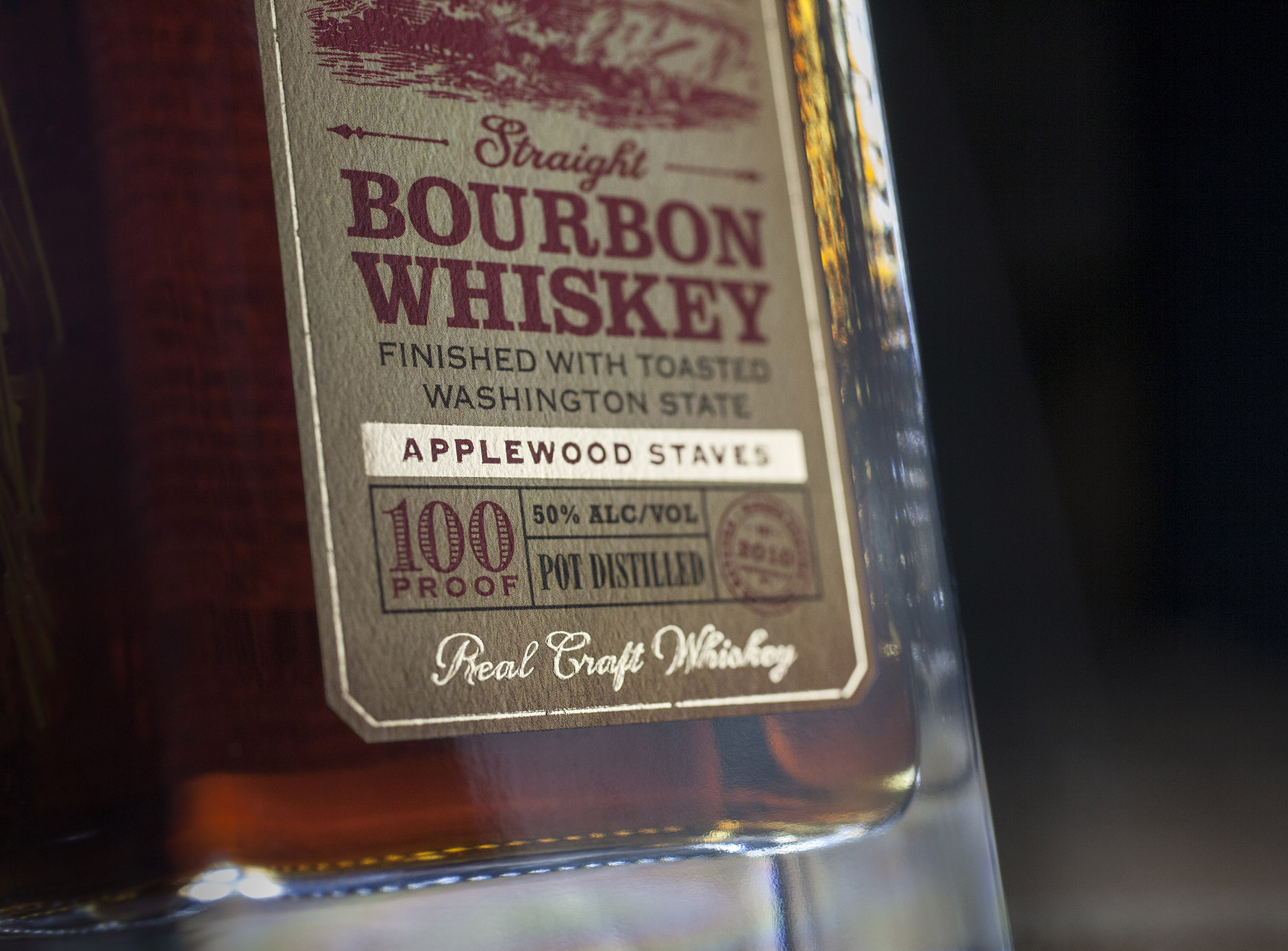
One issue in particular is the requirement that Bourbon, Rye and other types of whiskey, which are “finished” in wood (sherry cask, etc) other than the required new, charred, American Oak, have to be submitted with a formula and under the type/class of “Distilled Spirit Specialty” (DSS) – and are no longer considered true “Bourbon” or “Rye” etc and, as such, are not allowed to make age statements of any kind. The DSS category is intended for flavored products such as “root beer whiskey” and bottled cocktails but it also has become the catch-all for anything else the TTB doesn’t know what to do with.
There is a clause in the DSS labeling guidelines which requires the entire DSS name to be formatted with the same font, in the same size and using the same color throughout. These names can be quite long and cumbersome, for example “Kentucky Straight Bourbon Whiskey Finished in Cognac and Armagnac Casks” – whew! Not only does this make a big mess of producer’s package design efforts, it also makes the product name, in fact, harder to read and understand for consumers. A big block of like-styled text such as that has been proven to be harder to read then text with some visual hierarchy of information, structured in such a way that the eye and the brain can take in the information, in a certain order, one piece at a time.
I understand, of course, that they are trying to prevent producers from using the word “BOURBON” in large type and following up with the “non-bourbon” details in small, unreadable or de-emphasized type for the sake of being misleading. I get it. If it was “BOURBON” in large type with “with apple flavoring added” or “blended with grain neutral spirit” in small type, that would certainly be something we all want to avoid. Indeed, I wish there was a governing body in charge of making sure that all decaffeinated coffee was marked with a large red banner labeling it as such.
But the use of special wood finishes is usually viewed by consumers as a desirable augmentation to the product, which still retains much, if not all, of the defining character of it’s original type & class (Bourbon, Rye, etc).
Furthermore, the prohibition of age statements on these products – in my experience – has only prevented producers from displaying the true and desirable ages of their products which would have surely been attractive and benefiting to the consumers. I’ve had to omit 4, 5, 7 and 12-year age statements from finished bourbons because of this clause which, to me, seems like an unintended and unfortunate consequence in the law. Surely, the misleading labling of blended and flavored Bourbon and Rye derivatives can be prevented with some nuanced type size and placement requirements that are a little more sensitive to the practice of finishing these products in special wood and/or barrels.
Perhaps a sub-category could be allowed, specifically for Bourbon & Rye (all whiskey with Type & Class requirements, including the forthcoming American Single Malt, etc) which are subsequently finished in wood after their type/class required American oak. No flavors, no coloring, no other additives, just special wood finishes. This would be a new TYPE under the Whiskey CLASS. Allow (require) the age statements, as per usual. Allow some flexibility in the type formatting so that the labels can be designed in an attractive and meaningful way. Do indeed regulate the type formatting in such a way to require that the special wood finishing information is present, clearly visible, large enough to be readable and is placed directly adjacent to the type & class designation. All other TTB-required information is already required to meet minimum type-size requirements. The same can easily apply to this.
Specially-Finished Whiskey is a growing category, I can testify to this by the increase of such products to cross my desk in the last couple years. Let’s give them the recognition they deserve, quit lumping them together under the “Distilled Spirit Specialty” catch-all category and finesse the labeling requirements accordingly so that producers can make the most attractive and informative labels possible for the benefit of everyone involved, including consumers.
See example comparison, below.
This label, below, was approved in 2016 before the TTB started enforcing the regulation. It was never intended to be in violation of the law or the spirit of the law. At that time, the type formatting rules which applied to this particular situation were somewhat obscure, no one I asked was even familiar with them. The label was approved. I think you would agree that this label is perfectly forthright and informative for the sake of the consumer. This label, however would no longer be approved, purely due to the type formatting.
For sake of comparison, see these three example layouts:
A. This is the label shown above, as it was approved in 2016.
B. This was a 2018 line extension as it was originally proposed, but the formatting was no longer deemed approvable.
C. This label is in full compliance with the law, as it is currently being enforced. Note that the entire DSS name is formatted in the same font, at the same size and in the same color.
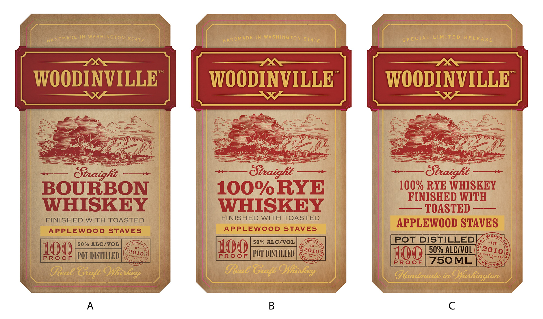
It is my opinion that the label shown in example C is not only significantly less attractive, but it is actually harder to read and therefore less informative for the consumer, which is counter to the intent of the law (and quite burdensome for both producers and folks such as myself).