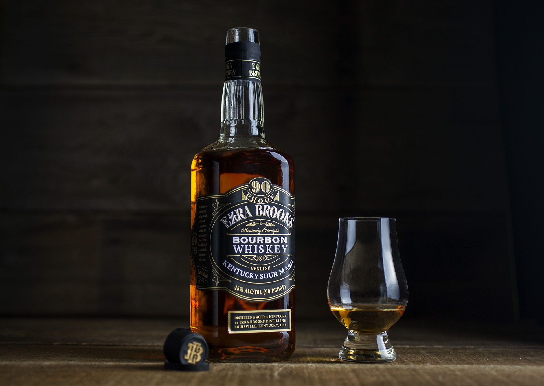
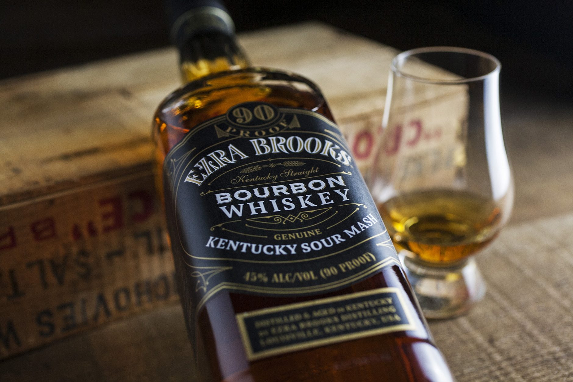
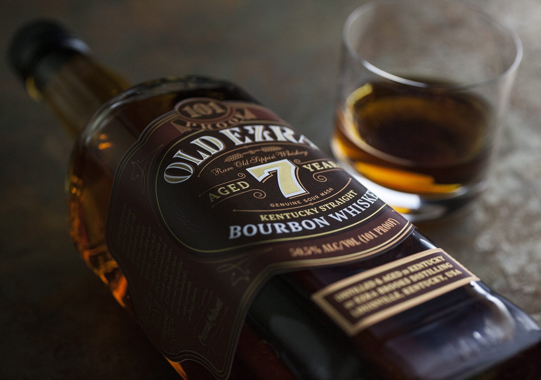
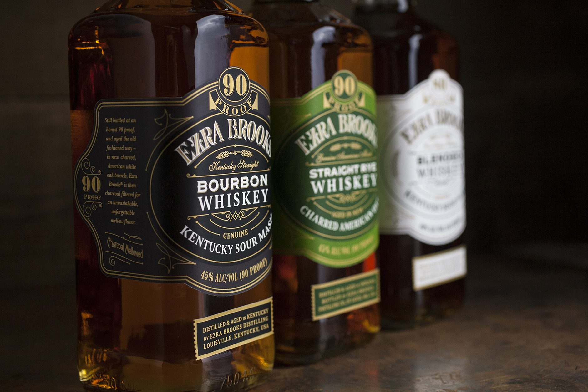
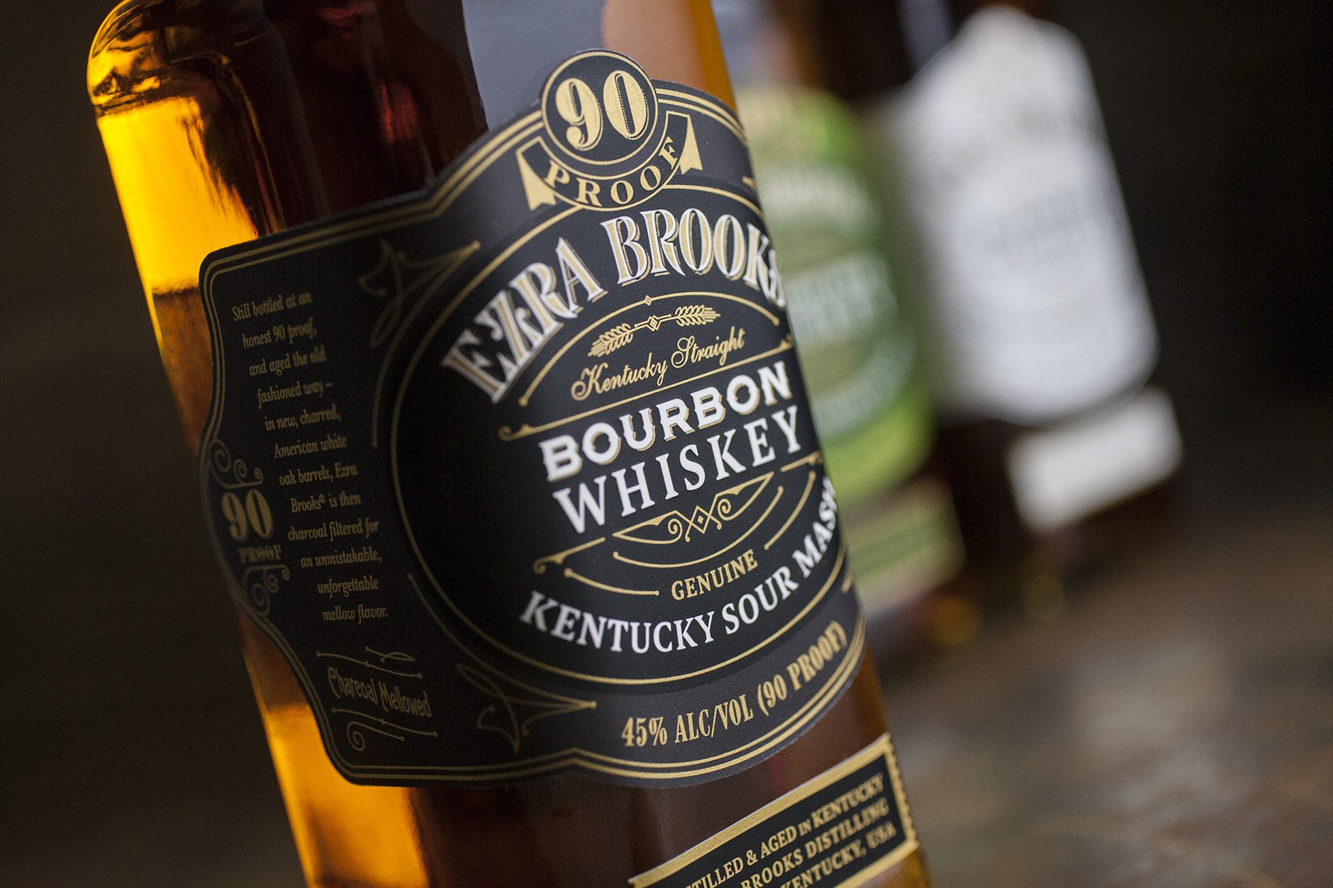
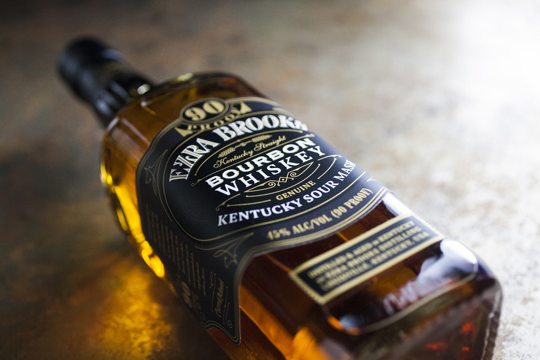
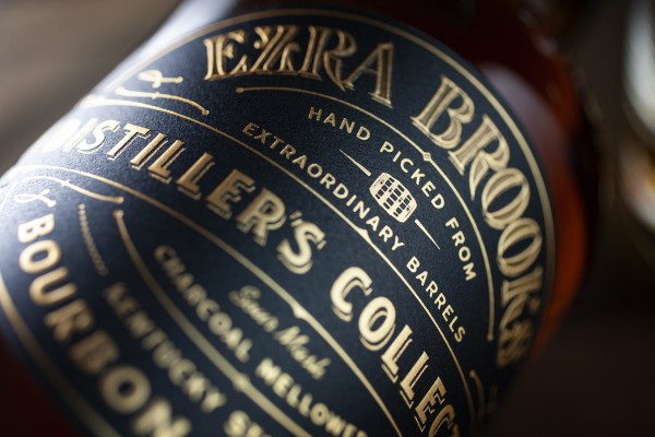
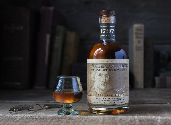
Ezra Brooks
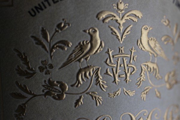
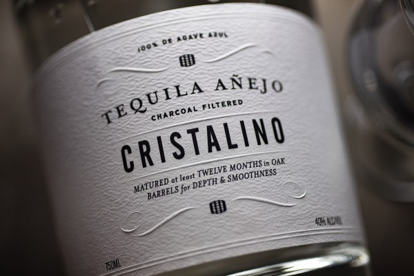
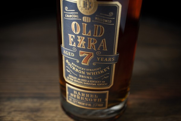
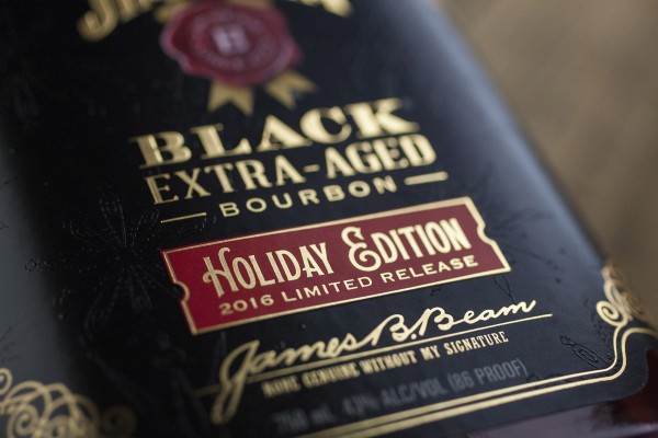
Ezra Brooks is a classic American Bourbon with a long heritage and a loyal following. But years of neglect left the brand and the bottle looking decades out of date and out of synch with the current whiskey drinker’s aspirations. The goal of this redesign was to bring the brand’s visual component up to current standards – while remaining recognizable and respectful of the brand’s history.
Elevating a brand a few rungs up the ladder is one thing, but doing so for a high-volume brand on a high-speed bottling line is another beast altogether. Bottling and labeling equipment limitations and the resulting print/materials restrictions mean navigating an extra set of challenges to achieve a look that is both functional and attractive. And huge case volumes means that every penny-per-label really adds up.
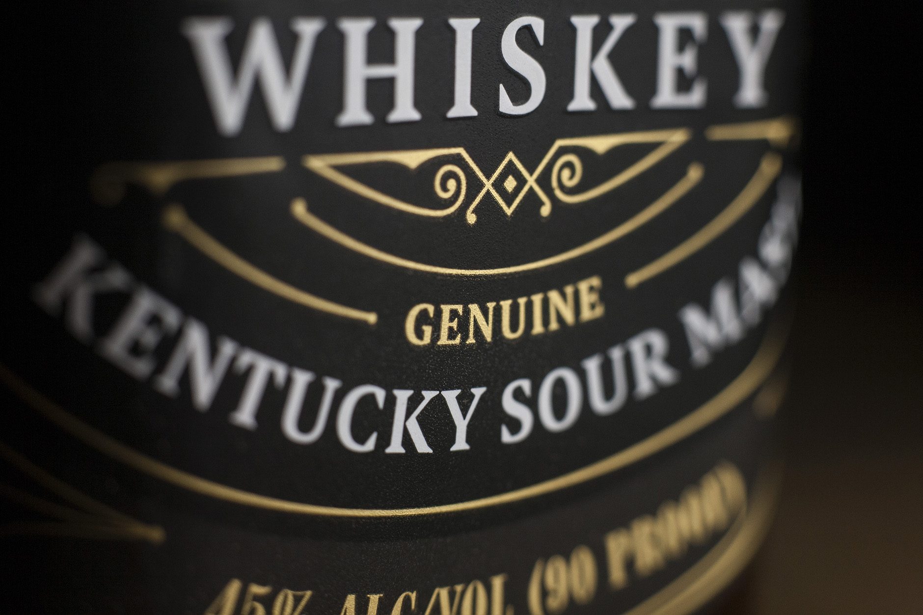
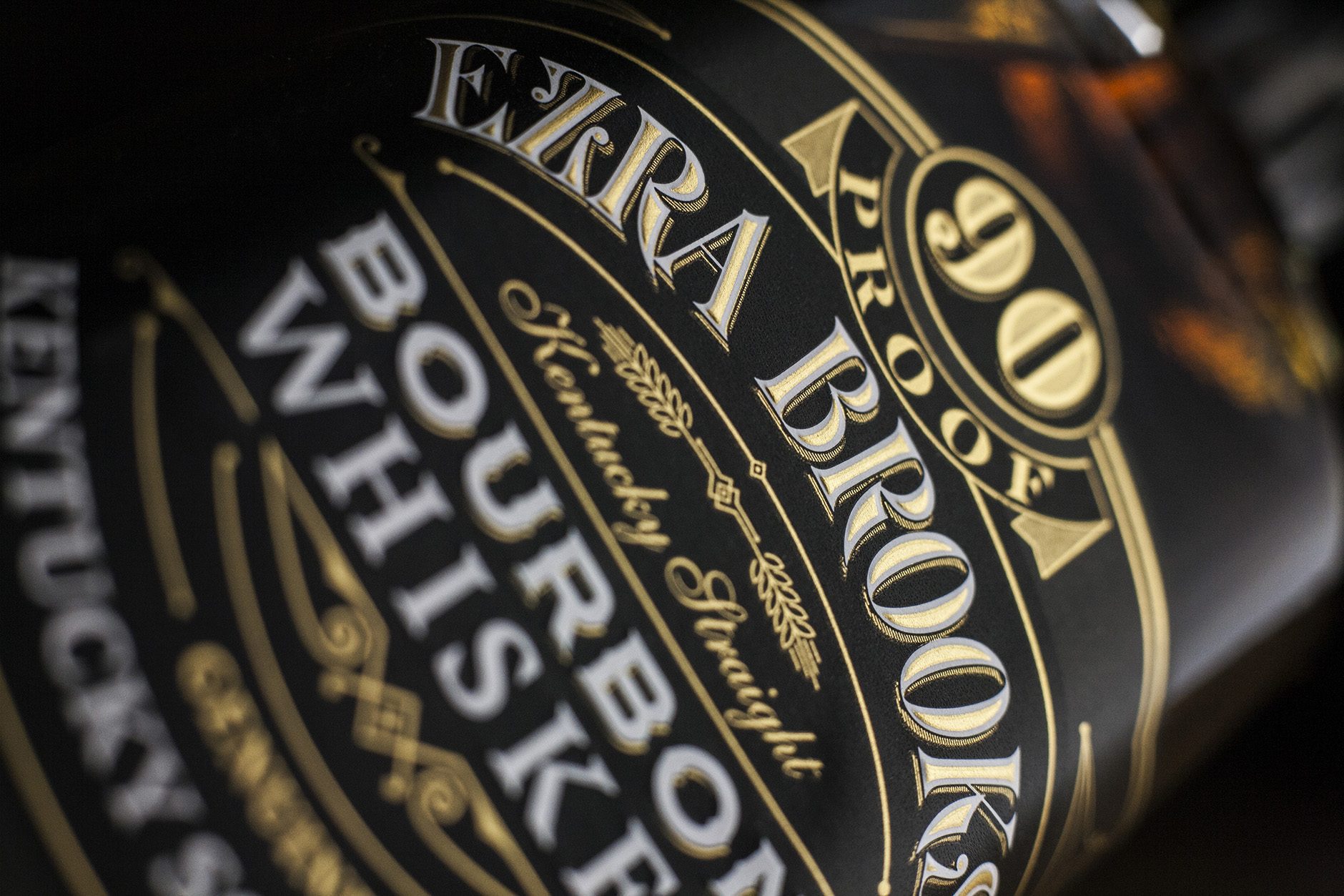
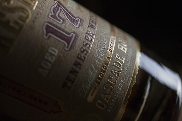
Overcoming all these hurdles in a way that connects with today’s highly-selective bourbon buyer – in a marketplace that emphasizes craft and authenticity above all else – was tricky. Natural, uncoated paper and metallic foil-stamping were not options. The labels were printed on synthetic film, utilizing metallic inks for glitz and an innovative “sandpaper” varnish to achieve an attractive matte finish and pleasingly gritty hand-feel.
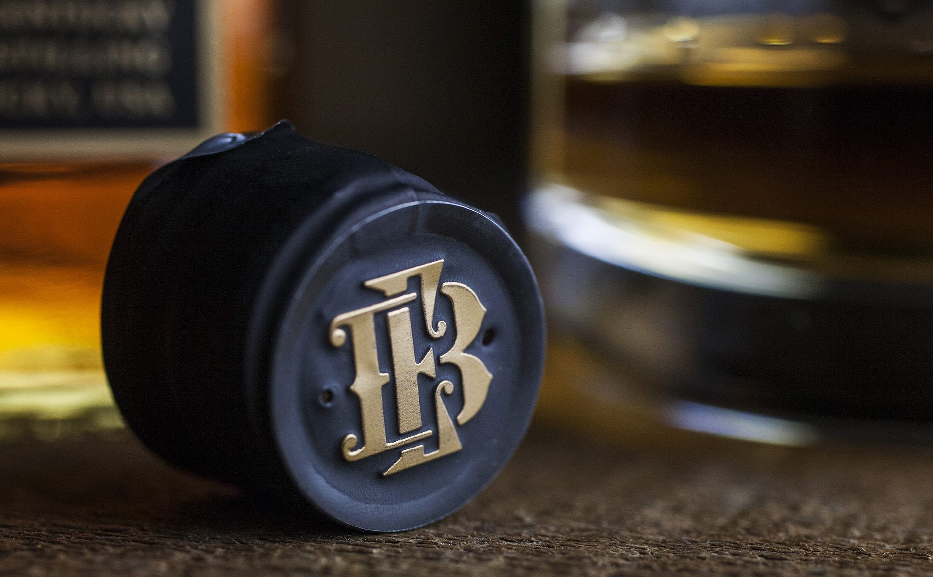
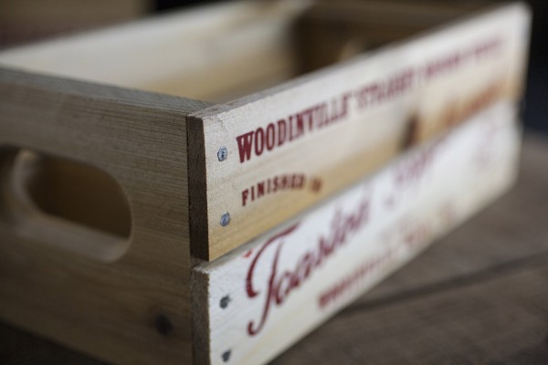
The old plastic screw-cap was replaced with a natural cork bartop finish and a matte-coated PCV shrink sleeve for a more traditional and premium look. After a complete logo re-design (including a new, secondary brand mark – the monogram), the entire Ezra Brooks product line was re-designed, including three new SKUs for 2016, for a total family line of six products.